It is widely known that the loading time of websites has a major influence on the overall user experience. If on the age of 56K Modems people would be willing to wait even half a minute for a website to load this time span has been drastically reduced lately. The are market researches, in fact, confirming that users will just skip a site altogether if it fails to load within 4 seconds.
The first part of the “Speed Up Your Site” series will cover how to optimize images. Images can create an extra load on the size of your pages, specially if you forget to optimize them. Photoshop and similar image editing software include a feature called “Save for the web”. Always use this feature since it will reduce the image size and load time substantially.
If you do not use an image editing software or if you want something more practical you can use this online image optimizer from Dynamic Drive. It will automatically optimize gif, png and jpeg images, and it will also convert file formats if needed.
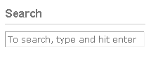
Most blog templates come with search forms that have no text inside the input area. While this standard solution is fine, you might want to personalize your search form by adding a default text to it.
The text can help readers to identify the search area more easily, encourage them to use the search function or even clarify the searching process for non-experienced users. Here are some examples of texts that you can include on your box:
Search
Search here
Search this blog
To search, type and hit enter
Now lets clarify how to place the text inside the search form. The first thing you need to locate is the the search form code. WordPress users should be able to find it within the header.php or sidebar.php files, depending on where your search box is located. Once you find the code look for the a line similar to this one:
<input type="text" name="s" id="s" size="20"/>
Now you will need to add three new arguments inside that line:
The last two arguments make sure that the text you inserted will disappear once the user clicks on the input area, and also that it will reappear if the user clicks somewhere else. The final line of code will look like this:
<input type="text" name="s" id="s" value="Text to be displayed here" onfocus="if(this.value==this.defaultValue)this.value='';" onblur="if(this.value=='')this.value=this.defaultValue;"/>
Getting your blog categories organized should be a straight forward task, but too many people seem to get confused when structuring their categories, hence why I decided to expand the topic. Below you will find 5 practical tips for organizing and making your categories more efficient:
1. Category names must be descriptive: your categories should orient even first time visitors across your blog. An old time reader will certainly know that under the category “Uncle John” there will be all your posts containing Windows XP tips coming from your uncle John Smith who works at Microsoft, but I will not! The categories tell a lot about your blog, and when readers can not figure what is going on around them it is very likely that they will just skip the blog altogether.
2. Limit the total number of categories: there is a reason why this is called “categoriy” and not “every single post that was written on this blog”, meaning that you should not create a new category for every other post that you are writing. Every blog should have a defined structure and a set of categories to support the topics of the posts, once you have that basic structure in place just fill the posts inside the existing categories, creating a new category should be done rarely and only when it is really necessary.
3. Make sure they fit in 1 screen: if you ask me how many categories your blog need the answer would probably be: it depends (no shit). Some blogs will work well with few categories, others will need 10 or even 20, just make sure that all the categories fit in one screen. Why? Because it is damn annoying to have to scroll down to see the complete list. Imagine I am trying to figure where a specific post was placed, once I get at the bottom of your categories I will probably have already forgotten what was on the top…
4. Try to put posts inside one category only: as a rule of thumb every time I write a post I try to place it inside one category only. I am opposed to monthly archives and to calendars (because the time when the content was written is not relevant) so the only way my reader has to find posts is through the categories. Guess what, if I placed posts inside multiple categories the reader would find the same posts over and over again, which is not cool, to say the least. Exceptions can be made when a certain post really touches more than one category, but those situations are more rare than what most people seem to think.
5. Display the number of posts inside each category: if your blog platform allows you to display the total number of posts inside each category do it. This feature will make sure that the reader knows what to expect when he clicks a certain category, and it also gives a general orientation about the most discussed topics on your blog.
Humans are lazy and there is nothing you can do about it. If you keep that fact in mind when designing your website or blog you will have higher chances of success. One point where people often forget about the widespread laziness is on the comment system.
Every single time that I was asked to do something other than leaving my name and email in order to post a comment I just skipped the idea of commenting altogether. I admit that sometimes I try to read those fuzzy letters of CAPTCHA filters, but only when I am REALLY eager to leave the comment.
Comment moderation is another interesting thing. Many people use comment moderation to be secure about the comments that will appear on the site. In my opinion comment moderation do more harm than good, though. Firstly because when I post a comment I want to see it on the site straight away. Second because if I read that my comment was held to be approved I will get the idea that you are suspecting of my good faith when commenting. Once you have a spam filter plugin on your blog there is no reason to moderate comments, the worst that can happen is that you will need to delete a couple of stupid comments once in a while.
Summary of what should be avoided on the comment system:
CAPTCHA filters
if you like CAPTCHA filters make sure those letters are READABLE
comment moderation
wordpress login (i.e. “You need to be logged to leave a commentâ€)
email confirmation
anything else that add more steps to the commenting process
A favicon (short for “favorite icon”) is that small icon displayed on the browser URL bar, on the bookmark lists and, for certain browsers, on the navigation tabs. While a favicon will not drastically change your traffic it will certainly improve the look of your blog, adding a unique icon and making sure that readers are able to individuate your site inside bookmark lists easily. Below you will find a step by step guide to create a favicon.
1) General Guidelines
A favicon is nothing more than a 16 pixels by 16 pixels icon, and the file has a .ico extension. As you can imagine it is pretty difficult to put complex graphics in such a small frame. When designing your favicon, therefore, you should concentrate on simple images or letters. Make sure that the color of the favicon reflects the color of your website, so that readers will be able to associate the icon with the site.
2) Using Photoshop (skip this point if you are not using Photoshop)
Adobe Photoshop is probably the best alternative for a well-designed favicon. The standard Photoshop can not handle .ico, so the first thing to do is to download a Windows Icon Photoshop Plugin (you can download it here).
Once you have the Plugin installed you should create a 64 x 64 pixels canvas and start playing with it. After you are done designing the favicon you will need to resize the image. Go to the Image Size menu and click Resample Image. This process will make sure that the image will not blur as you scale it down. Finally just save the 16 x 16 image as “favicon.ico”.
3) Using MS Paint and web tools
Favicons are very simple image icons, meaning that even Microsoft Paint should be enough to create a good looking one. The easiest way is to create a 32 x 32 pixels JPEG image with Paint and then use the online service “Favicon from Pics“ to convert the JPEG image into a favicon.ico file.
4) Uploading the favicon.ico file
Once you are done with the favicon.ico file you should upload it to your site. Just make sure you place it in the root directory, which is the directory where the index file is located.
5) Changing your header
The final step is to change your header, which is the code that goes between the<head>and</head>tags. All you need to do is to add the following line:
Notice that this code will only work if the favicon.ico is located in the root directory.
6) Testing
Everything should be in place now, just open your browser and point to your site to check whether the favicon is appearing or not. Bookmark the site and open a couple of tabs to see how the icon is looking, if you do not like it just go back to the drawing board.
Some time ago I was dedicating quite a lot of time to another blog that I have, but the RSS subscriptions were not going up so fast. It was strange because the articles I was writing were being featured on some high authority blogs, meaning that people were reading them but not subscribing to the blog.
After some time I decided to redesign the sidebar, and I included an RSS subscription button on the top right corner of every single place. Bingo! RSS subscriptions skyrocketed that very same day. Prior to those changes I realized that I only had an RSS subscription button on the home page. People that were coming from other blogs directly to an article page, therefore, were not even seeing the option to subscribe.
Make sure you do not forget to do the same. The two best places to put the RSS subscription button are the header (like TechCrunch) and the top of the sidebar. Also if you are using only a text link to your RSS feed perhaps you should considering adding a big icon next to it (feel free to download the one I used in this post). Visitors need to be able to see where they need to click to subscribe in a matter of seconds, otherwise they will just skip it.
Google announced a collection of new apps and services at Google I/O and while there is no new version of Android yet, Google is pushing mobile services and apps further, a pre-emptive strike on iOS 7 which we expect late this year.
While some of the Google announcements are still a work in progress, the company is pushing forward and raising the bar in several areas.
Even without Android 4.3, there are plenty of new Google services that now beat Apple’s offering. Unlike new Android versions, Google is pushing the new features directly to apps, This means most Android users can already enjoy them, a move that is much more like Apple’s iOS rollouts.
Here are four areas Apple needs to step up the game in iOS 7 to keep pace with Android.
After Google I/O 2013 Apple needs to step it up in several areas when it comes to iOS 7.
Google+ Photos: Auto Awesome
Google+ frees smartphone photos from the smartphone screen and pushes them to the web with a host of improvements.
In iOS 6, PhotoStream sends iPhone photos to the cloud so users can share them with others and can view them on all their Apple devices, but the new Google+ photos features go much further.
Android users can now use Instant Upload to swiftly upload all their smartphone photos to the cloud, which is where the real magic happens. Google can recognize the scene, tagging photos as concerts, recognizing landmarks and more. But again, this is just the start.
With Google+ Photos the service can automatically fix photos with “Auto Awesome” a new feature that detects the photo scene and adjust corrections.
Once the photos are enhanced, the service also solves the issue of which photos to share, something that is a blessing for anyone who has ever taken 1,000 photos on vacation. Google+ Photos finds the best photos in the bunch, weeds out duplicates and creates a Highlights album to make sharing the best photos you take easier.
Compared to PhotoStream, which only keeps the 1,000 most recent photos on devices and doesn’t do anything to make the photos look better or organize them automatically, Google+ Photos is way ahead.
Google Beats iRadio to the Punch
Apple is widely rumored to be launching iRadio this summer, an Apple music subscription service which would offer full access to the iTunes catalog for On demand streaming, and likely personalized playlists a la Pandora.
Google beat Apple to the punch with the Google Play Music All Access announcement this week, which lets new users access a vast library of tracks for $7.99 a month the service will jump to $9.99 a month at the end of June, but it’s price right to compete with Spotify and other music streaming services.

 Most blog templates come with search forms that have no text inside the input area. While this standard solution is fine, you might want to personalize your search form by adding a default text to it.
 A favicon (short for “favorite icon”) is that small icon displayed on the browser URL bar, on the bookmark lists and, for certain browsers, on the navigation tabs. While a favicon will not drastically change your traffic it will certainly improve the look of your blog, adding a unique icon and making sure that readers are able to individuate your site inside bookmark lists easily. Below you will find a step by step guide to create a favicon.