Monday 20 May 2013

Customize the Feedburner Chicklet


feedcount.pngThis tip is easy to implement but it can be very useful if you are trying to customize the text on your Feedburner Feed Count Chicklet. Just look into the HTML code that Feedburner provided you for the Chicklet and locate the address of the image:
src="http://feeds.feedburner.com/~fc/
blogname?bg=246cb0&fg=000000&anim=0"
Now you will need to add the follow attribute to that address:
&label=yourtext
Therefore the final line will look like this:
src="http://feeds.feedburner.com/~fc/
blogname?bg=246cb0&fg=000000&anim=0&label=yourtext"
You can use this feature to display something more catchy than “readers” like “fans” or “addicts”. Alternatively if you have two of more feeds on your blog (i.e. one for entries and one for comments or one for each language) you can also customize the text to differentiate them (an example can be seen onAndrea‘s blog).

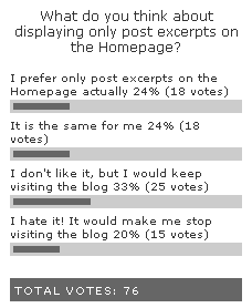
Post excerpts on the Homepage?


Lately some blogs are starting to display post excerpts instead of full posts on the Homepage (e.g.Pronet Advertising). There are both advantages and disadvantages with this method.

Advantages

Displaying only post excerpts will ensure that you are not incurring any search engine penalties for duplicated content. If you display full posts on the homepage you will have the exact same content on two places, that is on the Homepage and on the single post pages (provided your archives do not display full posts, which could worsen the problem). Some SEO experts (including Michael Gray on this video) argue that this reason alone is sufficient for displaying post excerpts on the Homepage.
Apart from the SEO benefits displaying only post excerpts on the Homepage will also boost the number of page views and possibly the number of comments. Readers that before were used to reading posts on the Homepage will now need to visit single post pages (increasing the page views) and they will see the comments on every post. Should they find an interesting or provoking comment they will be much more likely to leave a response.

Drawbacks

So far so good, but displaying post excerpts on the Homepage will also have some drawbacks. Traditionally blogs were created with full posts on the front page and readers are used to this feature. A Homepage without full posts might damage the user experience for those readers since it will add an extra click before they can access the content.
The question then becomes, do the mentioned advantages out-weight the drawback coming from the user experience? Below you will find a poll to investigate the issue:
postexcerpts.png

Create a functional footer for your blog


This is a very important factor that many people (including myself until some time ago) tend to overlook. When you use images or tables on your pages you should always include the height and width tags. If the browser does not see those tags it will need to figure the size of the image, then load the image and then load the rest of the page. Here is an example of code containing those tags:
<img id="moon" height="200" width="450" src="http://www.domain.com/moon.png" alt="moon image" />
When the height and width tags are included the browser will automatically know the size of the image. As a consequence it will be able to hold a place for the image and load the rest of the page contemporaneously. Apart from the improvement on the load time of the page this method is also more user friendly since the visitor can start reading the text or other information while the image is being downloaded.
Speed Up Your Site Series:
  1. Optimize Images
  2. Image Formats
  3. Optimze Your CSS
  4. Use a Slash on Your Links
  5. Use the Height and Width Tags
  6. Reduce the HTTP Requests

Speed Up Your Site: Use a slash on your links


When a server opens a link in the form of “http://www.domain.com/about” it will need to figure what kind of file or webpage is contained on that address, wasting time on the process. If instead of using that link you include a slash (“/”) at the end like “http://www.domain.com/about/” the web server will already know that the link points to a directory, reducing the time to load the page.
The improvement on the loading time of links ending with a slash will not be astronomical, but when it comes to speeding up a website every small bit helps!
Speed Up Your Site Series:
  1. Optimize Images
  2. Image Formats
  3. Optimze Your CSS
  4. Use a Slash on Your Links
  5. Use the Height and Width Tags
  6. Reduce the HTTP Requests

Optimize your Meta Description Tag


The Meta Description Tag (placed between the head and /head tags) is used by some search engines to create the snippets of text that you see right below the results on search queries. It does not carry any weight in the search algorithm of Google, but it does carry a certain weight for Yahoo and other smaller search engines so you should not neglect it altogether.
One problem with the Meta Description Tag of most websites is that it is static. People usually include a general description about the site, which is suitable only to the home page. Should a visitor find an internal page (say a single post) through a search engine the tag will be the same, containing no information about the content of that internal page whatsoever. You can use the SEO tools listed here to check the quality of your meta description tags.
In order to optimize your Meta Description Tag you should make it dynamic, making sure that it will include the first few lines of text of every single page on your site. A very simple way to do this under the WordPress platform is to make the Description tag equal to the post excerpt, like the code below illustrates.
<meta name="description" content="<?php the_excerpt() ?>" />
Alternatively you can download a plugin called Head META Description. Just upload the plugin, activate it and insert the following line on your header:
<?php head_meta_desc(); ?>
The plugin will generate the Meta Description automatically, either by extracting the first words of your posts or by displaying the post excerpt (you can configure it).

Improve your Adsense targeting


One of the most common complaints about Google Adsense is that the ads are not relevant to the website’s content. Non-targeted ads can drastically reduce your earnings since visitors of your site will not necessarily be interested in ads that are not closely connected to the topic that they were looking for in the first place.
There is a very simple way to improve your Adsense targeting, and it is called section targeting. There is no trick behind this technique, and Google itself incentive users to use it, here is a quote from the Adsense Help Center:
Section targeting allows you to suggest sections of your text and HTML content that you’d like us to emphasize or downplay when matching ads to your site’s content. By providing us with your suggestions, you can assist us in improving your ad targeting. We recommend that only those familiar with HTML attempt to implement section targeting.
So how do you implement section targeting? All you need to do is to place the following tags before and after the content that you want to get targeted:
<!-- google_ad_section_start -->
Content to be targeted here
<!-- google_ad_section_end -->
You can use as many sections as you want inside your page, and you can also place them on the header of your page so that meta keywords will be included. Bear in mind that it might take up to two weeks before you see the results of the section targeting.

8 Tips to Optimize Adsense Units


Adsense is one of the most common revenue generators for blogs and websites. Usually you can drastically improve your click-through rate and overall earnings by positioning the ads wisely, by improving the content targeting or by optimizing the ad units directly. Below I will cover the last point, how to optimize the Adsense units with 8 simple tips:
  1. The three top performing ad units are: 336×280 large rectangle, 300×250 inline rectangle and 160×600 wide skyscraper. Consider using those units if possible, but bear in mind that other formats might be more suitable for your website design.
  2. The most successful link color is blue. This fact is connected with the roots of the Internet where all major websites used to feature blue links.

Speed Up Your Site: Optimize your CSS


Speed Up Your Site: Optimize your CSS


Cascading Style Sheets make websites much more efficient because they allow the browsers to cache style-related information from the .css file directly, removing the need to read that information every time a single page is loaded. Even if Style Sheets are naturally more efficient than HTML tables you can still optimize the CSS code to make your website cleaner and faster.
First of all try to locate dispersed code and aggregate it together. For instance instead of:
margin-top: 10px;
margin-right: 20px;
margin-bottom: 10px;
margin-left: 20px;
you should use:
margin: 10px 20px 10px 20px;
Instead of:
<p class="decorated">A paragraph of decorated text</p>
<p class="decorated">Second paragraph</p>
<p class="decorated">Third paragraph</p>
<p class="decorated">Forth paragraph</p>
you should use:
<div class="decorated">
<p>A paragraph of decorated text</p>
<p>Second paragraph</p>
<p>Third paragraph</p>
<p>Forth paragraph</p>
</div>
Secondly you can also try a CSS optimizer tool like CleanCSS. Those tools are supposed to merge similar selectors, remove useless properties, remove whitespace and so on.

Speed Up Your Site: Image Formats


On the first part of this series we discussed how to optimize images in order to reduce their size and consequent load time (click here to read). Apart from optimizing the images it is also important to choose the right format. You should use the GIF, PNG and JPEG formats based on the type of the image and on size constraints of your website. Below you will some guidelines for each format:
JPEG: Stands for Joint Photographic Experts Group. This format was created for photographs and fine art-work. You should use JPEG images whenever you are displaying a photo or a true-color image. Notice that if you are using compression to reduce the file size you should use a 50% compression rate for optimal results.
GIF: Stands for Graphics Interchange Format. The GIF format is connected with the history of the Internet, mainly because of its small size. JPEG images support millions of colors while GIF ones will integrate a maximum of 256 colors. You should use this format for flat-color images like logos, buttons or text images. GIF is also the format of choice for animated images.
PNG: Stands for Portable Network Graphics. The PNG format was created specifically for the Internet, with the objective of replacing GIF images. The main advantage of PNG images over GIF ones is that they support 24-bit colors and alpha transparency. That said not all the browsers recognize some of its features. You should use the PNG format for simple images that require more than 256 colors.